

Bajwa’s Handwerksbäckerei
Brand Strategy, Identity & Spatial Direction
Bajwa’s Handwerksbäckerei was developed from the ground up as a craft-driven bakery with a clear position in Berlin’s market. I worked closely with the founders during the early stages to define how the company should be understood, experienced, and expanded.
This project involved more than visual output. It required clarity around structure, communication, and long-term direction.


Establishing Brand Direction
Before developing the identity, we defined the principles that would guide every decision.
The bakery is rooted in traditional German baking. That heritage needed to be respected without turning into nostalgia. The brand had to acknowledge its foundation while presenting itself as contemporary and forward looking. It was important that the visual language felt current, disciplined, and confident rather than rustic or sentimental.
Three core principles shaped the direction.
-
The products are traditional. The expression is modern. We avoided visual clichés often associated with European bakeries and focused instead on structure, balance, and restraint. This allowed the brand to feel established without feeling dated.
-
The space needed to feel welcoming and human while maintaining precision. Materials, typography, and layout choices were guided by this balance. Nothing overly decorative, nothing overly cold. The experience had to feel considered and approachable at the same time.
-
From the beginning, the brand was developed for long term growth. The color palette was selected to feel organic and timeless. Warm neutrals create familiarity and trust, while controlled contrast ensures clarity across applications. The goal was to build something reliable and adaptable rather than something visually loud.
Reference Framework
Spatial Language
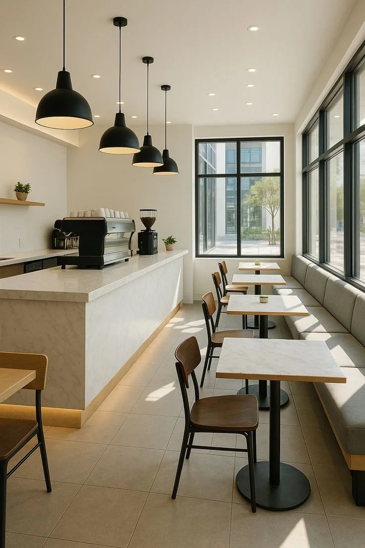
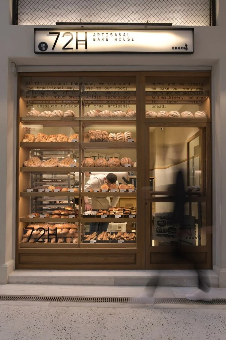
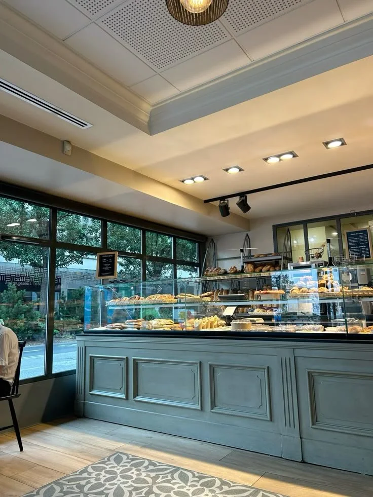
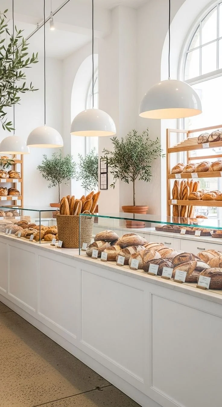
The interior direction focuses on openness, light, and order. Product display remains central, supported by structured shelving and controlled material use. The environment avoids visual clutter and instead prioritizes clarity, balance, and long term relevance.
The space needed to feel composed and dependable rather than decorative. Every spatial reference supports that logic.
Product Tone

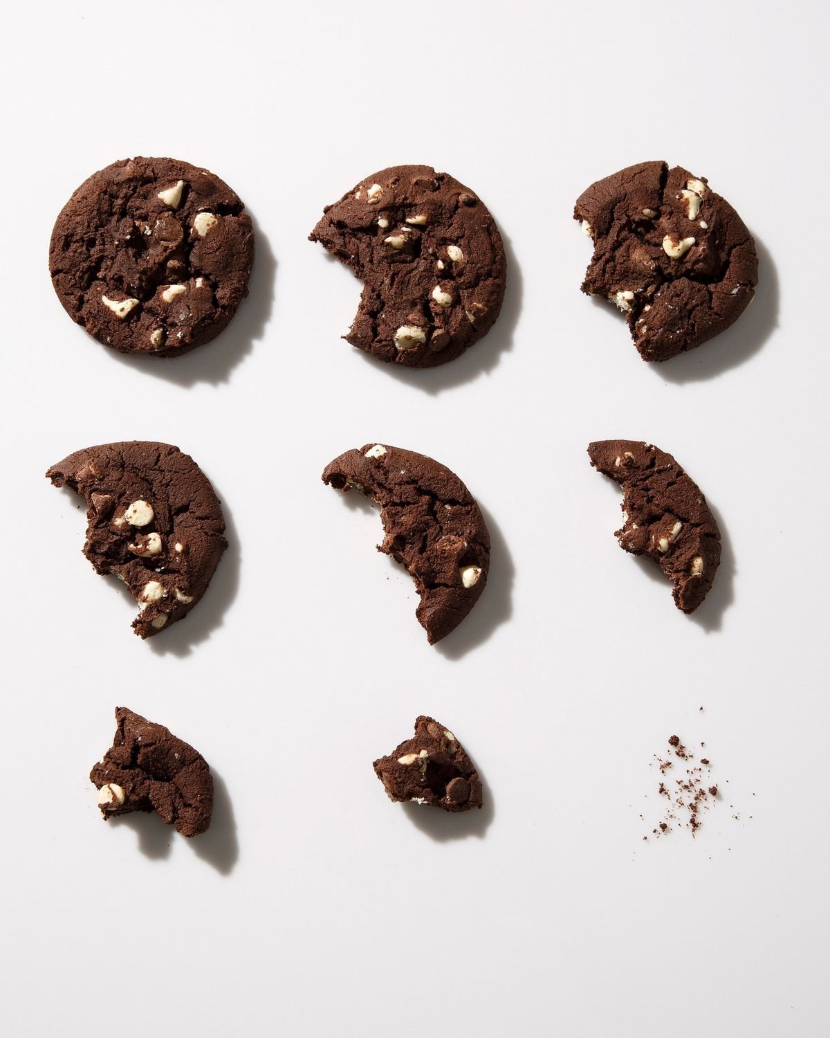
Close attention was given to texture and surface quality. Natural materials such as wood, stone, and metal reinforce authenticity while maintaining visual restraint. Product photography and presentation emphasise detail and craft without exaggeration.
The intention was to communicate quality through composition and material honesty, not through stylistic excess.
Packaging Logic
Packaging references were chosen for their simplicity and consistency. Neutral styles and structured layouts provide flexibility across formats while ensuring recognizability across product categories.
Each application supports continuity without relying on heavy branding.
Visual Identity
The identity was developed as a structured system rather than a standalone mark.
At its core is a modular grid that governs proportion, spacing, and alignment across applications. This framework ensures consistency across print, packaging, and spatial use while allowing flexibility where needed.
The symbol draws from repetition and contained geometry. Its construction reflects order and rhythm, mirroring both production discipline and spatial balance.
Typography was selected to maintain clarity at multiple scales. Hierarchy is intentional, with strong legibility in both large-format signage and smaller printed materials.
Colour application remains restrained. Neutral tones create stability, while controlled contrast ensures visibility and differentiation across touchpoints.
The result is a cohesive identity that performs consistently without relying on decorative elements.
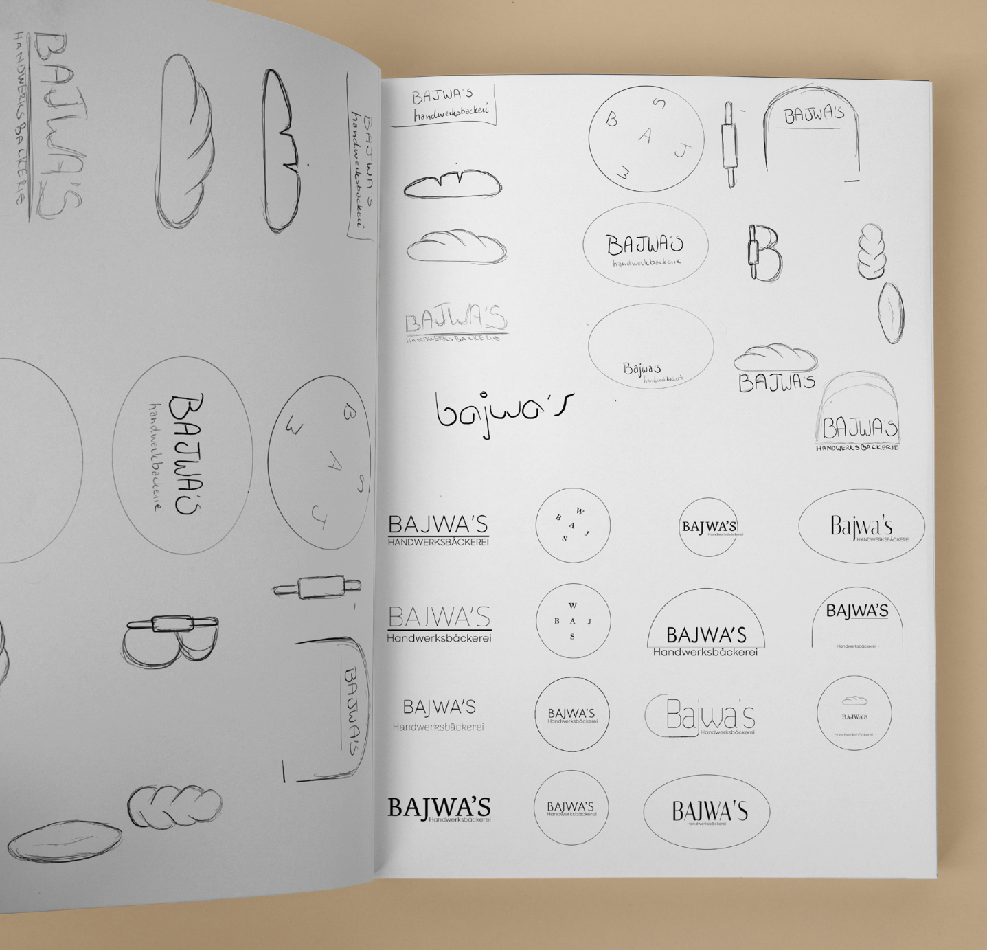
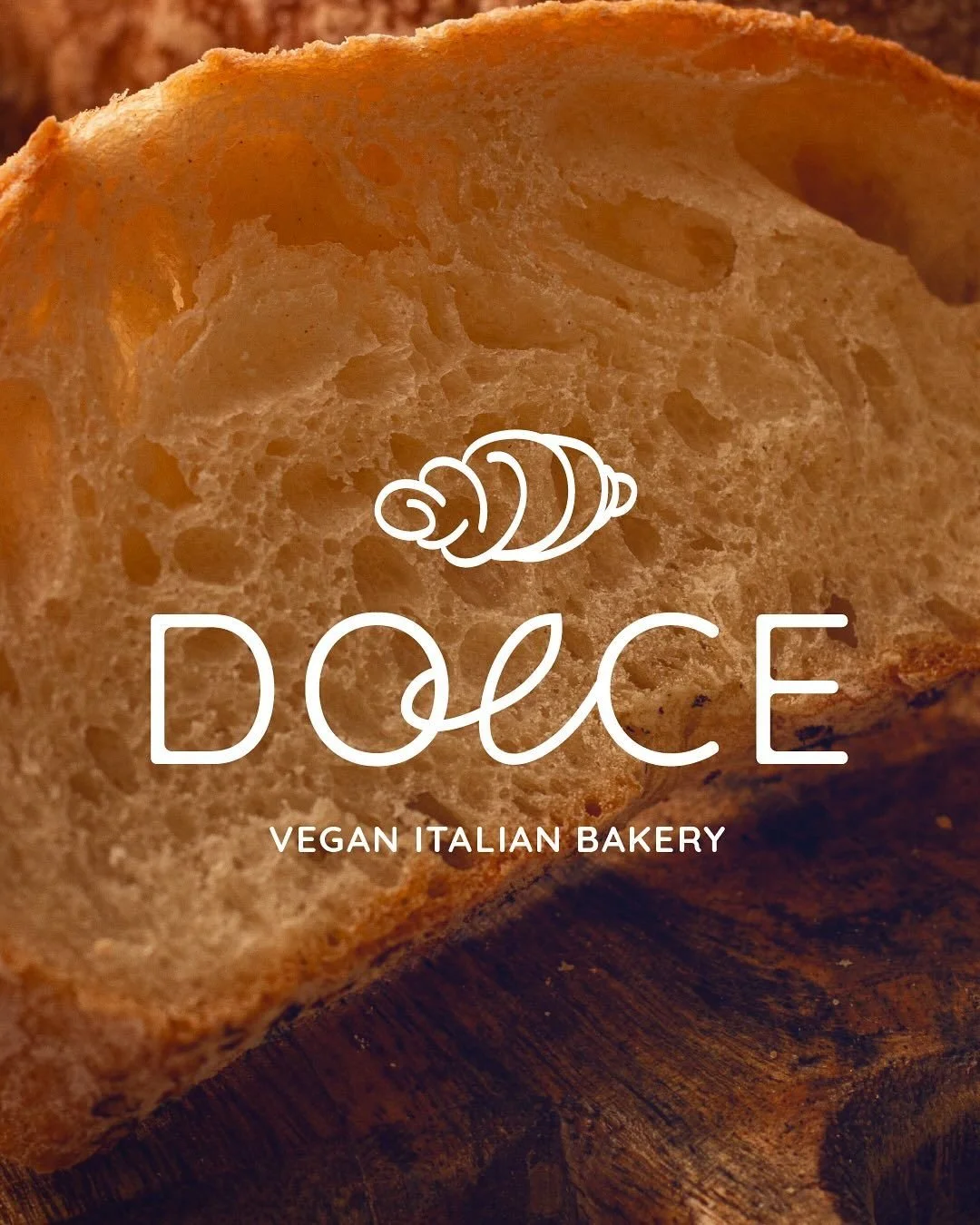
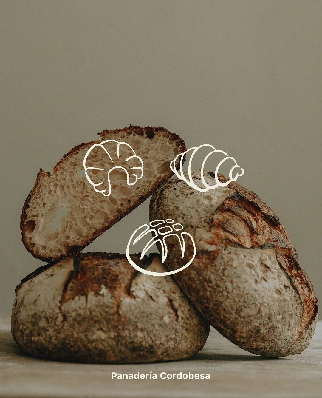
Logo Mark
The logo originated from an early typographic exploration of the name Bajwa’s. By duplicating and mirroring the capital B, a floral form began to emerge. This initial observation informed the direction of the mark.
The final symbol was then reconstructed with precision. The form was refined into a symmetrical structure, maintaining balance while introducing softer curves to reflect the organic nature of the bakery’s products.
The result is a contained, recognizable shape that feels structured yet natural.

Constructing the logo
After the initial concept was identified, the mark was redrawn and built on a controlled geometric framework. Symmetry became central to the system, ensuring consistency across all applications.
The curves were carefully adjusted to avoid stiffness, allowing the symbol to retain fluidity without losing alignment. Proportions were defined to ensure clarity at both large and small scales.
This process transformed a typographic idea into a scalable identity mark.

Colour System
The colour framework is built on a foundation of browns and natural neutrals that anchor the brand in material authenticity. These tones provide stability across interiors, packaging, and printed materials.
Alongside the core neutrals, four product led accent colours extend the system. Each is derived from real ingredients and menu items rather than abstract brand references.
These accent tones are not used as dominant brand colours. Their role is to support product categories, seasonal communication, and menu hierarchy.
This approach allows the identity to remain consistent while adapting visually across offerings.
Interior Designing
The bakery was proposed to be timeless, maintaining the traditional shelves and look of the previous century but adding bohemian elements to give a homely vibe to the place. To visualise and conceptualise the ambience of our bakery, we resorted to AI prompting to render out certain themes, such as walls, shelves, usage of our colour schemes etc.
The pictures shown below in the grid are all AI-generated with Mid Journey and Dall-E.


Menus
The menu layout prioritizes readability and structure. Typography, spacing, and alignment follow the same logic as the broader identity.
This maintains continuity across printed and in store applications while allowing flexibility for seasonal changes.
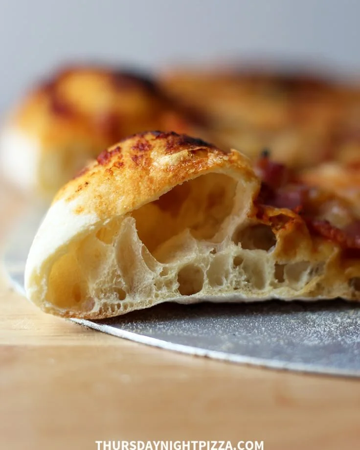
Pizza
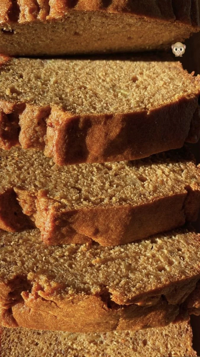
Brunch
